Recently, I hosted an online training called the Foolproof Travel Agent Website.
I’d never hosted a training like this before, so a shout out to all the travel pros who joined me on the training to make it a success! (And who ensured I wasn’t just teaching to my mom … HA!).
One thing I talked about on the training was how and why you should be specific in your web copy.
Because specificity sells.
And I’m not just talking about specifically listing your specialties or niches on your website.
It goes deeper than that.
I’m talking about using specific, vivid, CONCRETE language to draw out desire and transport your readers to a specific moment and place in time.
If you can make your reader feel as if they’re already on vacation, with your specific words, the need to reach out to you and start planning their vacation becomes much more immediate.
The Specificity Test for Your Travel Agent Website
Here’s how to know if you pass the test: If what you’ve written can be used on any travel agent website, it’s not specific enough.
Take a look at this example. Now you might find this paragraph on the home page of a travel agent’s website, as an intro:
“Get ready to jet off on a vacation and have the time of your life! Explore the destinations you’ve been dreaming of, make incredible memories, and do it all without having to plan it yourself.”
That’s pretty generic—any travel agency could use that intro … and that’s how you know it’s not going to be effective.
An intro that’s full of specifics, on the other hand, may read like this:
“You lean back in your private cabana, and soon, your personal butler is at your side with another frosty pina colada.
You take a sip as you watch the sun sink below the watery horizon, the rays casting a kaleidoscope of soft colors over the waves. You sink your toes deeper into the powdery white sand and think: “Now this is a vacation.”
Now—I’m betting you’re yearning for a beach vacation yourself after reading that!
Do you see how just those few lines are chock full of details?
She’s not just watching the sun set—she’s watching the colors cast over the ocean.
She’s not just sipping a drink— she’s sipping a pina colada, brought to her by a butler.
Those specific, vivid details bring the intro to life, transport the reader, and truly draw out desire.
What do you want *your* readers to feel?
Now, of course, this intro wouldn’t work for any travel agency. But that’s why it DOES work—it’s specific to a particular niche, like beach vacations or all-inclusives—and particular to a specific kind of ideal client. One who truly wants to relax on vacation.
The more specific you can get, the more you’ll make your reader feel.
And it’s that powerful emotional connection that brings in leads.
Wait, Don’t Go! Grab Your Free Website Checklist
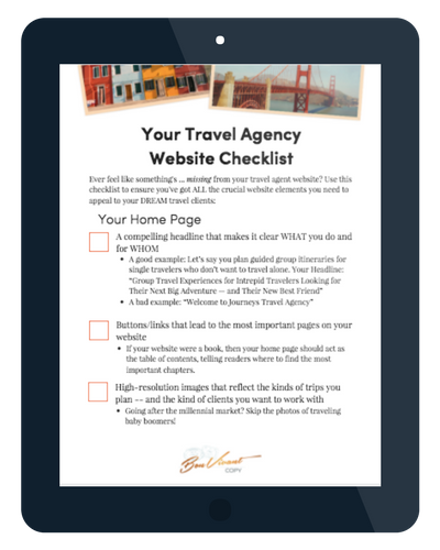
What else does your travel agent website need to convert visitors into clients? I’ve got a (free!) checklist for you! Grab yours below (pina colada not included):

