How “healthy” is your travel agent website?
Is it operating at full steam or just sputtering along?
There are a lot of ways to answer that question.
If you’re tech savvy, you could check your Google Analytics to see how long folks are staying on your website (if they’re “x”-ing out after 8 seconds, for example, your website’s got a bad case of can’t-keep-’em-around-itis).
Even if you never set up Google Analytics, you probably have a pretty good idea of how healthy your website is. Just think about the leads you’ve got coming in—are they coming from your website? Are they coming in consistently?
If the answer to either question is “no,” it’s time to diagnose your website woes.
Now it could be that the root cause of your website runs deep—for example, your website is just not speaking to your ideal clients.
That’s a sickness you just can’t bounce back from easily. You need to go back to the drawing board when it comes to your website copy.
Or maybe, your website is simply a bit under the weather.
Meaning: You’ve done a good job targeting your website to the needs and desires of your ideal clients. There still feels like a disconnect, though, and you’re not sure why more of your web visitors aren’t converting into leads.
If that’s you, good news. There are several tweaks you can make if your website is already relatively healthy.
Think of these as your website vitamins—they’ll make a good website stronger, but they can’t bring your website back from the brink of death 😉
Here are several ways you can get your travel agent website up to full strength:
Your 7 Travel Agent Website “Vitamins”
1) Add a headline to every single page.
Headlines grab your visitor’s attention and clue them in to what they’ll learn on that page. Without a headline, your web visitor’s attention will wan—before they’ve even read a single word!
2) Write in shorter paragraphs.
Your paragraphs can even be just one sentence long (proper grammar rules don’t apply when you’re writing for the web). This will make scanning your content way easier for your readers.
3) Break up long chunks of text or lists with bullet points.
Do this for the same reason above—bullets are easier to scan and digest.
4) Introduce new sections on your web page with subheads.
These subheads act as mini-headlines, cluing your reader in to the topic of the next section. As such, they should be larger font and bolder than the rest of the text on your page.
5) End every page with a call to action (CTA).
What do you want your visitor to do next? Tell them! Don’t make them decide. Because they may just decide to move on from your website …
6) Turn your CTAs into buttons.
We’ve been trained to click buttons (both online and offline). So you’re going to get higher click-through rates if you format your CTAs as a button, as opposed to simply a hyperlink.
7) Make your buttons stand out.
Your web designer may not like this suggestion … but it helps if the color of your button is NOT a color from your brand palette. That way your button sticks out more, bringing more attention to it—and raising the chances your web visitor will actually click!
Take your website medicine (with a full glass of water) and you’ll be at full strength soon 🙂
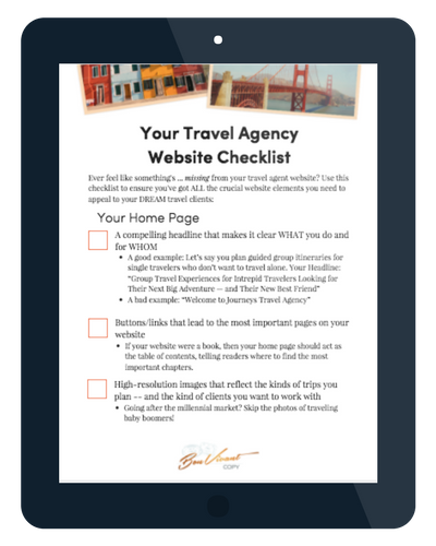
Diagnose Your Website Woes: Get Your Free Travel Agent Website Checklist
Is your website still feeling under the weather? Get the full 16-point checklist to discover what ails your travel agent website:

